
Graphic Design

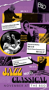
JAZZ MEETS CLASSICAL
Directive: Emphasize the festival like month of jazz meets classical concerts through key art. Make the music of the large works on each program front and center. Leverage Music Director Jonathon Heyward’s passion for the fusion of the two genres through social media, digital advertising, direct mail, and email marketing.
Task: Design a comprehensive campaign across print and digital mediums to drive ticket sales for 4 concerts. Attracting new audiences interested in jazz without alienating our traditional classical audience.
Campaign Results:
-
10% over goal capacity for the month
-
$457,000 in paid revenue
-
Exceeded revenue goal by $2,583 for final concert
Campaign Formats:
Digital Graphics, Social Media, Printed Flyers/Poster, Direct Mail Bifold


Direct Mail - Bifold 9 x 11 - sent to 42,953 households.


Flyering - Audience Development


Buy Tickets Now
>
Paid Social Carousel: 2.2% KPV rate, 287 purchases, $36,172 revenue, 1,006% ROI (Data via Capacity Interactive)


Digital Lobby Screens
Research and Development

Mood Boards
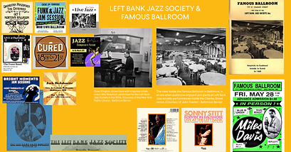
I researched Baltimore's rich jazz history and pulled inspiration from the Left Bank Jazz Society and Famous Ballroom, a Jazz club in Station North that saw many artists perform there, including Ellington and Strayhorn. I also drew aesthetic inspiration from designers Romere Bearden, Paul Rand, Reid Miles and David Carson, as well as the poster styles of Baltimore's Globe Collection and Press.
Positioning:
November at the BSO offers a festival like atmosphere with a series of concerts that will take you on a captivating musical journey that bridges two iconic genres, jazz and classical.
Secondary Positioning: Focus on the big works on each program including Debussy La Mer, Sibelius Symphony No. 5, Ravel Piano Concerto in G, and music of Duke Ellington.
Iterative Design Process


Concepts:
Jazz Meets Classical
-
Classic Jazz Poster Feel
-
Instruments Exploding out of Ripped Paper
-
Romance or Boxing Match between Jazz and Classical Instruments
-
Newspaper article
In some initial iterations, I also mocked up custom lettering mirroring the style of the Left Bank Jazz Society program masthead I found.


Typography:
Larsseit - Sans Serif, Grotesque front from BSO Brand Style Guide
PF Fuel - from Adobe Fonts to achieve a screen printed, jazz poster style look.
Photography: Sourced from photos provided by artists and stock images of instruments. Converted to black and white and experimented with opacity settings and texture overlays to further achieve a printed look.


